Amsterdam Music Theatre, The Dutch Opera, and The Dutch National Ballet wanted to merge. Three organisations with three different cultures had to become one and express themselves as one institution. Not an easy task. The key to success: a clear leitmotif on which to base all choices. Dutch National Opera & Ballet stands for superior simplicity and you will notice that in everything.

An important insight was the fact that music theatre is about motion. Logical you would say, but until then all communication materials used a static image. To efficiently produce those images, they were created in a few days for the entire season. Twenty images in total. With the added advantage that all the material would be available at the start of the season.
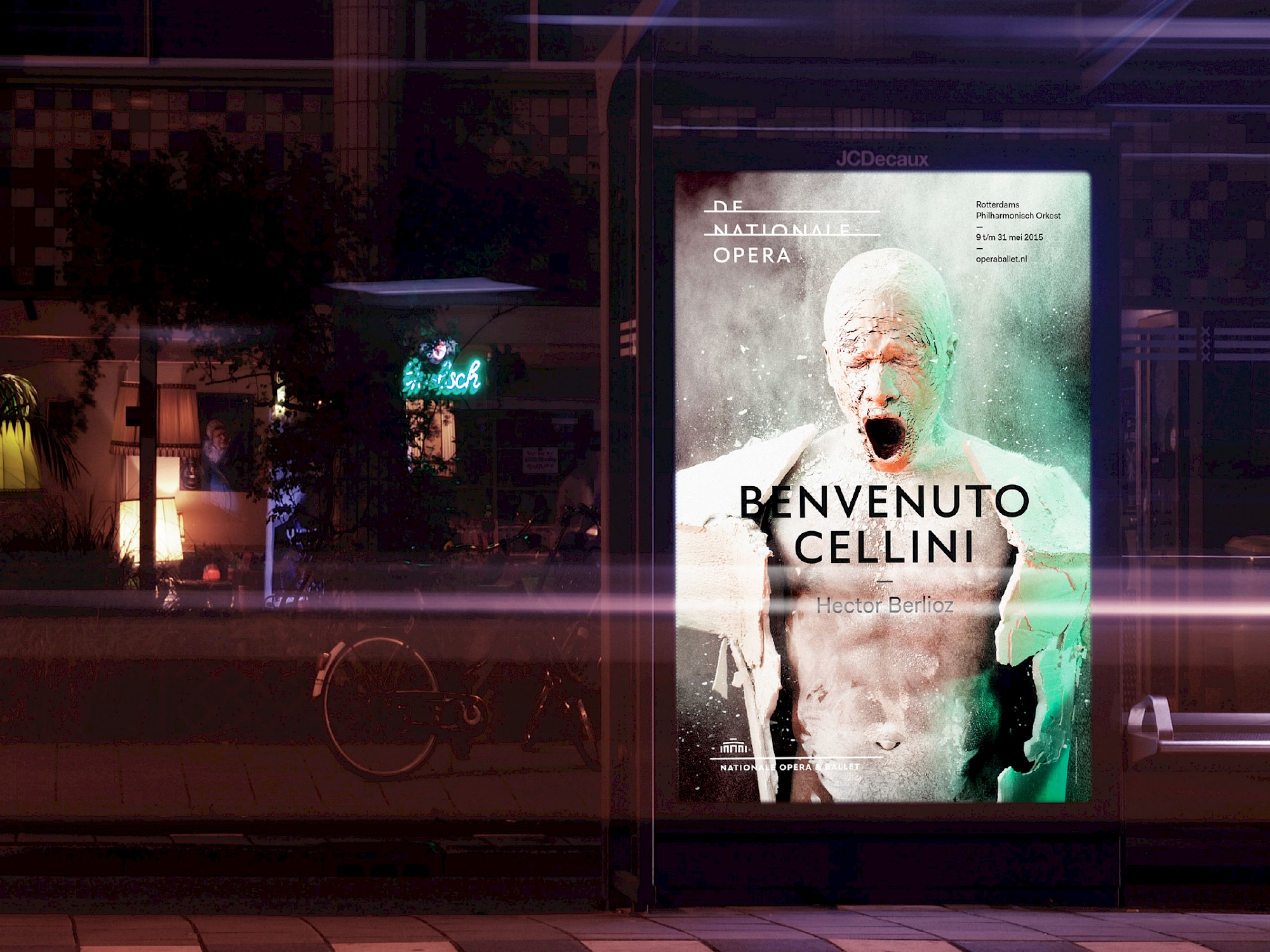
The result of the house style operation was a new visual identity with a logo that acts as a neutral frame leaving room for the beautiful performances of the institute. A moving image concept for ballet and opera that allows for differentiation, but is also unique and recognisable. And a marketing communication strategy based on sales, but above all on enriching the visitor’s experience. And the most important result in a merger: a visual identity that was supported by all employees of the new Dutch National Opera & Ballet organisation.

